
Friday, October 30, 2009
Sunrise
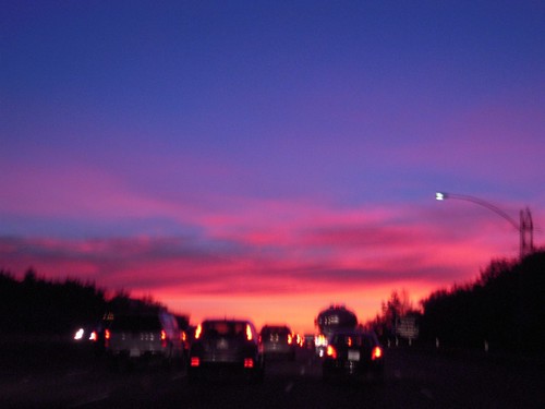
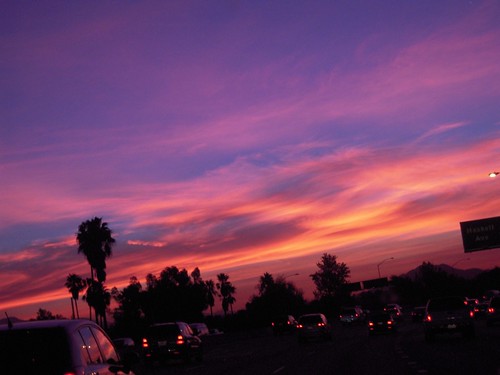
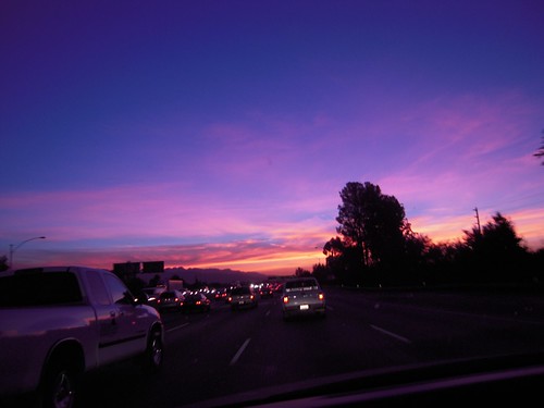
Sunrise today inspired me.
Inspired me to take pictures of it.
Inspired me to think more about simultaneous contrast.
Inspired me to notice how the oranges and blues reinforce each other.
Inspired me to post these pictures so you could see them!
Inspired me to take pictures of it.
Inspired me to think more about simultaneous contrast.
Inspired me to notice how the oranges and blues reinforce each other.
Inspired me to post these pictures so you could see them!
Thursday, September 3, 2009
Simultaneous Contrast
"Simultaneous Contrast" is quite a phrase and quite a concept. I'm in a study group on this to pic and I am in awe of how many ways there are to address the issues that it presents.
A fella by the name of Chevreul was the first to present his "law" of simultaneous contrast (among other things). Basically, this means that if two colors are next to each other (and are roughly the same size in area), each will shift as they are are affected by the (near) complement of the other.
So - if you look at red and green, the red looks more red and the green looks more green - since red and green are complementary colors!
It's easy to see if the colors are complmenetary colors to begin with - since they jsut intensify each other.
That's why red&green, orange&blue, yellow&violet are so eye-popping - all because of simultaneous contrast!
If you have colors that are not complementary, it gets a little more complicated.
Keep in mind that one color is affected by the neighbor of the other color's complement - thus the yellow surrounded by red will tend to shift towards a yellow-greenish tinge (green is red's complement and yellow green is nearer to or the neighbor of green when you look towards yellow. If you isolate that little yellow petal, the yellow looks like yellow - if you see it with the others around it - it shifts a tiny bit towards greenish. the red isn't affected since the yellow is so small.
 If you don't see that, how about the purple and green succulents - the green should look more yellow-green and the purple should look more red-purple since they are so plentiful and close in proximity.
Again, if you look at one color with the other blocked off and then compare the entire image, the colors do shift a bit.
This is your brain on Simultaneous Contrast!

How about this yellow with orange? The yellow should shift towards blue-green and the orange towards red-purple.
I'm having such fun with this and how it expresses itself in fiber. I'll have some photos of those project soon - they're not yet finsihed enough to make sense in a photo!
 pic and I am in awe of how many ways there are to address the issues that it presents.
A fella by the name of Chevreul was the first to present his "law" of simultaneous contrast (among other things). Basically, this means that if two colors are next to each other (and are roughly the same size in area), each will shift as they are are affected by the (near) complement of the other.
So - if you look at red and green, the red looks more red and the green looks more green - since red and green are complementary colors!
It's easy to see if the colors are complmenetary colors to begin with - since they jsut intensify each other.
That's why red&green, orange&blue, yellow&violet are so eye-popping - all because of simultaneous contrast!

If you have colors that are not complementary, it gets a little more complicated.
Keep in mind that one color is affected by the neighbor of the other color's complement - thus the yellow surrounded by red will tend to shift towards a yellow-greenish tinge (green is red's complement and yellow green is nearer to or the neighbor of green when you look towards yellow. If you isolate that little yellow petal, the yellow looks like yellow - if you see it with the others around it - it shifts a tiny bit towards greenish. the red isn't affected since the yellow is so small.
 If you don't see that, how about the purple and green succulents - the green should look more yellow-green and the purple should look more red-purple since they are so plentiful and close in proximity.
Again, if you look at one color with the other blocked off and then compare the entire image, the colors do shift a bit.
This is your brain on Simultaneous Contrast!

How about this yellow with orange? The yellow should shift towards blue-green and the orange towards red-purple.
I'm having such fun with this and how it expresses itself in fiber. I'll have some photos of those project soon - they're not yet finsihed enough to make sense in a photo!
Friday, August 28, 2009
Colors in Nature
Just a quick note on color - in my preparations for the semester to begin, I've been appreciating the way that nature puts things together. It is simply amazing.
The oranges and greens of a poppy field, the blues, greens, and white of the ocean and sky...
I'm in a study group on Simultaneous Contrast - more to come on that - and the things I'm noticing about color simply amazes me. Specifically, how two colors together affect each other..
Look around and see what colors nature puts together!
Thursday, August 13, 2009
Summer?!
Wow - It's mid-August and I've not done most of what I had planned for the summer.
How does that happen??
I have been fiddling around with web stuff, straightening up my web sites (like this blog) and such - but not nearly weaving enough! And now it's mid-August.. Gah!
I have been making jillions of Kumihimo braids - that's Japanese braiding in case you've not heard of it. I always have a few projects that will involve them so I travel with them, using a foam disk instead of a marudai - since it's easier to go on trips and sit around with a little foam disk rather than a wood structure as big as a stool. I do prefer the marudai when I'm braiding with silk or other slippery fibers.
What do I do with all these braids? Well, I've made a napkin holder for my spouse (it's really a bib) - just put two alligator clips on the ends and, voila, a 'napkin holder'... ;-)
They can be drawstrings, trim on clothing or whatever, straps or belts or ... They can do anything your imagination produces!
I have been known to coil them into little vessels.
Here's one that I did last year - it was exhibited in Designing Weavers (Guild) "Sideshow" last year in Florida (during HGA's Convergence) at the Manatee Art Center in Bradenton.
I call it "One Ring Circus". It's actually got quite a dark expression on the circus theme.
Here's the text I wrote for its description:
"The circus has both light and dark, positive and negative, as people come together forming community - both audience and circus people - yet differences are magnified and life is difficult. The salience of animal involvement is also paramount as it is both joyful and sad as some people relish seeing wild animals up close and personal yet life for the animal is often violent and bereft of a natural habitat and rhythm. Circus life has structure, hence the fully formed coiled kumihimo ring, yet it has its dark side, reflected by the black and red pattern. There is only one ring and one elephant as the others have escaped and gone on an adventure of their own, to live life not as a spectacle but as an adventure to be experienced."
I find it poignant that I'm posting a note about this now as it was last summer's project. Time is passing much too quickly! Gott go weave!

How does that happen??
I have been fiddling around with web stuff, straightening up my web sites (like this blog) and such - but not nearly weaving enough! And now it's mid-August.. Gah!
I have been making jillions of Kumihimo braids - that's Japanese braiding in case you've not heard of it. I always have a few projects that will involve them so I travel with them, using a foam disk instead of a marudai - since it's easier to go on trips and sit around with a little foam disk rather than a wood structure as big as a stool. I do prefer the marudai when I'm braiding with silk or other slippery fibers.
What do I do with all these braids? Well, I've made a napkin holder for my spouse (it's really a bib) - just put two alligator clips on the ends and, voila, a 'napkin holder'... ;-)
They can be drawstrings, trim on clothing or whatever, straps or belts or ... They can do anything your imagination produces!
I have been known to coil them into little vessels.
Here's one
 that I did last year - it was exhibited in Designing Weavers (Guild) "Sideshow" last year in Florida (during HGA's Convergence) at the Manatee Art Center in Bradenton.
I call it "One Ring Circus". It's actually got quite a dark expression on the circus theme.
Here's the text I wrote for its description:
"The circus has both light and dark, positive and negative, as people come together forming community - both audience and circus people - yet differences are magnified and life is difficult. The salience of animal involvement is also paramount as it is both joyful and sad as some people relish seeing wild animals up close and personal yet life for the animal is often violent and bereft of a natural habitat and rhythm. Circus life has structure, hence the fully formed coiled kumihimo ring, yet it has its dark side, reflected by the black and red pattern. There is only one ring and one elephant as the others have escaped and gone on an adventure of their own, to live life not as a spectacle but as an adventure to be experienced."
I find it poignant that I'm posting a note about this now as it was last summer's project. Time is passing much too quickly! Gott go weave!
Tuesday, July 28, 2009
Ocean...
I've always loved the ocean - I'll never live too far away from it if I have any choice about the matter.
Weaving the ocean is something I attempt periodically on purpose yet it also makes its way into my other weaving projects subconsciously. The colors vary so much - so many different blues and greens, even gray and purple, depending on the ocean, sun, clouds, and weather.
My 'favorite' ocean is the Pacific around the Hawaiian Islands - the source of the photos below which I use often for inspiration, not to mention relaxation.


The photos (below) are from a project intended to weave the ocean and all the different colors within it. There are the expected blues but also greens and grays..
The fibers are primarily cottons although there are a couple of rayon threads in there. I added those since they are a bit more shiny than the cottons, thus invoking the sunshine reflecting off the water.
I like the cottons since they are not shiny - they are for representing the waters that run deep, through which you can see and in which you know are dwelling creatures and many forms of life.
 Here I used one of the neutral cotton blues for the weft while in the second, below, I used sewing thread.
Both of these show the colors of the warp nicely as I used plain weave for the structure.


The third photo shows how a twill weave pattern can mimic the waves and currents. Using different sizes of yarns, some moving together, some separately, a basic twill looks very complicated.
This twill closeup is of my favorite scarf, I often wear it. It's been in the washer and dryer many times and still looks good.
I love it when that happens (since that's not always the case).
Tuesday, July 14, 2009
More poppies
With regard to the poppies mentioned in my previous blog, here are more photos of what the series looks like - I made a number of different scarves from one very long warp. The scarf photo in my last blog was a bit washed out and the green is squirrelly thus here are more accurate images!

This first scarf (left) has a sewing thread weft. It's really lightweight and drapes and crunches up really well.
(Click on the photos and a larger image will load in.)
This next scarf (below) has a cashmere-merino weft. It's a still lightweight but it's a bit stiffer than the others - but it is a bit warmer when wrapped around your neck!

This last image shows the scarf with a weft from one of the cotton yarns in the warp. It's a lightweight scarf that drapes pretty nicely. though not as nicely as the one with the sewing thread weft...

The orange hues mixed with some green (for leaves) and brownish oranges (for the ground and shaded flowers) really reflect what I love in the poppy fields when they are at their best.
Sunday, July 5, 2009
Spring poppies
Every spring when the California poppies bloom, I am amazed at the range of colors in those blooms.


We try to drive out to Lancaster/Palmdale and see what we can of the blooms.

And every time we see them, there are pictures to be taken - and weaving to be done once I get home!

This is just a plain weave project that I did awhile back with different yarns, both smooth and bumpy, to mimic the range of colors and textures.
All yarns are cottons, no synthetics fibers here.
The flowers themselves but also the stems, leaves, and the earth below gave me the color palette.
Sunday, June 21, 2009
The Colors of Life
Hi! Welcome to my blog!
I'm continually intrigued by colors in nature. I use fiber techniques to weave the patterns and textures - and colors - that I see in nature.
The image in my blog title is one I took in Hawaii of lava - as it cools, it attains the different colors and they're in 'rainbow' order. That piece of lava is actually about 4 inches wide - it's tiny!
Below is the Inkle band I wove in response to the colors in the lava:

The lava ia amazing and I had to keep going - here's an Inkle Rope that I wove in response to this other type of lava:

The rope-y strands in the texture of the lava led me to do this project.
Here's what that piece of lava looked like:

Madame Pele and Mother Nature are amazing!
Subscribe to:
Comments (Atom)